Followers

Wednesday, 5 September 2012

Week 05 3D 2012

Class outline

Today's lesson we started with a group exercise: Challenging assumptions and then we followed up with a practical: Design challenge/Reflect and refine.
 

Group Exercise

Challenge Assumptions.

One student presents 3D design concept to the class then a open discussion on challenging design concept assumptions, three people each had to present.
 
Cherill's Helmet Cover:
What can you get printed on the material?
How much will it cost to make?
 
Challenge:
You can get most prints onto this material, since it's light, easy dry and soft, from logos, patterns, labels and/or text.
Depending on the materials and bullk purchase would affect the cost.
 
Queenie & Denise's Children's Book.
Would you publish it on the internet or leave as a hard copy?
Would it be a pop up or a fold out?
 
Challenge:
With the cost of print being little since it's being printed by E-print they are coninuting with the hard copy aspect.
Since kids love interactivity the pop up idea is strongly recomended by Queenie and Denise.
 

Practical

Design Challenge/Reflect and Refine

My Design:
I chose my Paper animation.
 
Assumptions:
Should I use the Idea of speech bubbles or not?
Is the idea of construction paper and the black back drop doing it justice?
 
Challenge:
The idea of speech bubbles didn’t work due to the lighting anyway, having not mouth make it easier with time. The eyes were a good idea until the fan came along. The presentation of “adventure time” and the letters expanding was superb.
The Idea of construction paper was to give the effect of layers and the next idea was to make the character to come out of the back drop. The first attempt of just hand drawn image was miss planed and may have gave it a morphing feel. Assuming I do continue with hand drawn images it would only stay black and colour.
Two Refinements:
After trial and error I fixed onto the colour and gradients idea, which will give it the ‘wow’ factor. By using a computer will benefit myself in the time factor of cut and paste to remodel, with the added bonus of a printer to if the ‘character’ comes out of the paper/movie.
Speech bubbles have been a real issue so I have refined to single image bubbles of their thoughts/words. Add in music to give suspense/drama, some images and characters have been made already for animation. Having to work of the previous art for this project learning has made it easier.


Week 05 2D 2012

Class Outline

Today's lesson we started with a group exercise: Challenging Assumptions, which was split into two parts. Then we finished with a practical: Design Challenge/Reflect & Refine.
 

Group Exercise

Part 1: Quiz & Open Discussion.

Question 1:
Relatives - A doctor in London had a brother in Manchester, who was a lawyer - but the lawyer in Manchester did not have a brother in London who was a doctor. Why?
 
He could of been a different brother or maybe he has a different profession.
 
Question 2:
Bottled Money - If you put a small coin piece in an empty bottle and replaced the cork, how would you get the coin out of the bottle without taking out the cork or breaking the bottle?
 
You could make an incision in the bottle 'technically' you're not breaking the bottle.
 
Question 3:
The Restaurant Meal - Three women each have two daughters, and they all go into a restaurant for a meal. There are only seven vacant seats in the restaurant, but each has a seat for herself. How do they manage it?
 
Because two are already sitting down at the table.
 

Part 2: Challenging Assumptions.

MIKE’S AUDITION:
1. What would be on your list of assumptions - if you were Mike?
2. Challenge each item in the list and find a solution to Mike's problem.
 
List:
Traffic jams
Miss a bus.
Over sleep.

Challenge:
Give extra time just in case.
Sleep then get ready then drive.
 

Practical: Design Challenge/Reflect and Refine.

List:
Character design is too simple.
Story line is too vivid.
Challenge:
Character Design:

The characters in this design are verging on chibi and manga style, The design of the body have problems such as should they have hands with 3 fingers, or just palms with thumbs? Should they look older? For example giving the characters necks to add age? Names and their relevance to the story, what dialog will they have? Will there be a dialog?
Story line:
The story line is a manipulation of my imagination based on true characters.  Yet with the story line being about zombies should the drama or panic be suspended by one or more characters? Which one? Will there be meaning behind the story other than a basic zombie type movie ‘save everyone’ theme
.
 
Two Refinements:
Refinement one: The structure of one character must be similar in one way to the others, such as eye shape, style of hair, overall length of limbs etc. I will grant these characters with three fingers and will give some aged look to them. Chibi stylized characters will be for comedic atmosphere.
Refinement two: Keeping the storyline to the main point and the event of the zombie arising, saviour and heroic moments and the conclusion would have to be scripted and sketched. Research with the questions ‘what would you do in a zombie attack’ to the characters would affect the story. Fight scenes would have to be minimal due to my preference.


Week 04 3D Design 2012


Class Outline.
The first hour we were to complete a group exercise; Generating design ideas, inventing options followed by a practical “design options”.
 
Group Exercise.
 
For this week’s group exercise “Experimentation: Exploring & Challenging” we were to choose the best of their designs from last week’s practical An eco-friendly design and brand it with a catchy name. With in the group were to vote on which one and using the idea of experimentation discuss and research how each chosen design concept could be explored and challenged. Scribing each finding from all three designs with these topics: Design Exploration and Design challenges. 

End Result.
Paul Myatt’s Screen Modifier:
Exploration and Challenges:
The thoughts of how this monitor could look more 'steam punk', how the overall design will effect the use with a iMac computer, and how will he benifit witht he finished product. The challenges with this design were that that OHS issues with live wires exposed, the practibility of the design function, and how well I can adapt this montior after the design. 

Walai Jomkoh's Boat Design:
http://walaijomkohdesign2012.blogspot.com.au/2012/09/week4-3d.html
Exploration and Challenges:
The usage of two items to create one better item, other light objects that float were explored. The challenges were is it safe to ride in? would it be convenient to use?
 
Queenie Wu's Children's book.
http://queeniewudesign2012.blogspot.com.au/2012/08/week-04-3d-design.html
Exploration and Challenges:

The illustration and storylione were explored here as well as age group.
The Challengers were what story should it be about, characters and if the children will like this book.
Practical. 

Design Exploration:
            Choose your favorite design concept from all your current works.
-          Use any tools we’d like.
-          And Describe.

Through a combo of research and creative thinking explore the possibilities of concept experimentation, variation and evaluation.

List these items clearly, draft examples and explain your thinking.

-          Two experiments.
-          Pros & Cons.
-          Choosing & Refusing.


End Result.

My design:
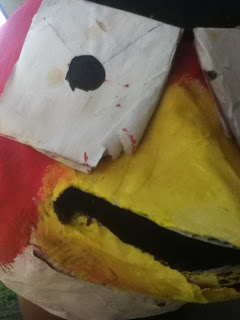
I chose my Angry bird pinata

 Experiments:
           
Experiment 1: Finished product (image)
Pros: GThe children enjoyed beat it with a stick, the ruggedness made it look cool.

Cons: Lack of materials were an issue, and time put in with trial and error.

Choosing and refusing: choosing which bird to use, or to make the green pig, and overall shape of this pinata.

            Experiment 2: the previous pinata.
                        The failed attempt.

Pros: Gave new structure ideas to the next idea.

Cons: Lack of materials and design process.

Choosing and refusing: Either to paint on the eyes or to make the eyes, add feathers or not.

Week 04 2D Design 2012


Class Outline.
The first hour we were to complete a group exercise; Generating design ideas, inventing options followed by a practical “design options”.

Group Exercise.

For this week’s group exercise “Experimentation: Exploring & Challenging” we were to choose the best of their designs from last week’s practical (Combo Words) which ours was “Dog Camping”. With in the group were to vote on which one and using the idea of experimentation discuss and research how each chosen design concept could be explored and challenged. Scribing each finding from all three designs with these topics: Design Exploration and Design challenges.

End Result.

Paul Myatt’s Web site layout
http://paulmyattdesign.blogspot.com.au/2012/08/week-04-2d.html
Exploration and Challenges:

The use of Fibonacci Spiral ‘Golden Ratio’ was explored as well as the overall layout and use of simple shapes. The challenges with this design is that the set use of squares than irregular shapes will affect the layout. If animated GIFs will supply interactivity or not, and  how different browses are affected by multiple AP Divs (floating).
 
Keiran’s Pony
Supplyed By Katelyn Preston.
http://katelynprestondesign2012.blogspot.com.au/2012/08/week-4-2d-design.html
Exploration and Challenges:
Colours, transparency and placement were explored for the right balance of the rainbow. The fiddly bits and gradients were a challenge for the overall design

Cheril’s pop art.
Exploration and Challenges:

Texture and saturation were explored with this design. The overall image was challenged by the patterned shape, right setting of blue and the fish picture placement.

Practical.
Design Exploration:
            Choose your favorite design concept from all your current works.
-          Use any tools we’d like.
-          And Describe.
Through a combo of research and creative thinking explore the possibilities of concept experimentation, variation and evaluation.
List these items clearly, draft examples and explain your thinking.
-          Two experiments.
-          Pros & Cons.
-          Choosing & Refusing.

End Result.


My design:

I chose my Helmet warrior being attacked by octopi, the tools I used were led pencil (2H, HB and 2B) on an A3 size white paper. The effect of depth I believe really gave it that ’oomph!’ factor.

 
Experiments:
           
Experiment 1: Fix and Colour fill in Adobe Illustrator CS5.
Use of colour and an over lay to represent the underwater feel.

Pros: Gives life to the image, adds a cartoon-ish style, can be used for a spread.

Cons: Doesn’t look realistic, no real gradients or texture, time spent adjusting layers.

Choosing and refusing: choosing the right colour fixtures, refuse black/out lines? How deep is this scene? (Brightness)

            Experiment 2: Retouching in Adobe Photoshop CS5.
                        The use of blurring and fill, paint brush settings and glow.

Pros: Give the real life feel, could add more depth to the image. To be used for a cover page for my VD for Illustration.

Cons: Lack of knowledge in Adobe Photoshop CS5, the right setting of blur, exploring and adjusting paint brush pattern settings.

Choosing and refusing: The transparency levels of the background, whether or not to add more aquatic life to the over image. Colours or the octopi.