Followers

Sunday, 12 August 2012

Week 03 3D 2012


Class Outline.
This week we had another group exercise to create a concept for an eco-friendly form of personal transport. Followed up by a practical, which was to create three more designs for the eco-friendly exercise.

Group Exercise: Creative thinking techniques.
In this exercise we were to create an Eco-friendly design concept using the idea of REDUCE and brand the design with a catchy name.

End Result.
 
A.T.T.A.C.K.= All Terrain Transporter for All Civilians that-are Keen.
Design:
       This Hovercraft is powered by the sun and spins both bottom fans and rear fan giving it lift and force. The roof is covered in solar panels; the tube around the vehicle is for shock absorption. A chain is connected to all three fans and the kinetic energy is stored into an accessory battery. Giving all the normal car features not to mention back-up energy for the night. Since this is a hovercraft is can drive on water, roads and even dirt roads making it All terrain.
 
-   Materials:
Aluminum, chains, Rubber tube, glass, Metal, and Solar panels.

-   Style:
It would vary since any car can be any colour, It would be similar to a swamp boat with a bunch of tweaks.

   Practical: Design Options
We were to individually draft a range of 3 excellent design options for your group’s eco-friendly form of personal transport.
For each design we had to:
- Brand each one with a catchy name.
- Use any tools we wished.
- Describe how each of these differ in:
- Function.
- Materials.
- Style.
- Or any criteria of our choosing.
 
End Result.


Street Sailor:
- Function:
               This design’s function is from using both     the sun and wind to move, with a windmill at the top of the sail to recharge the battery placed at the front and to add extra acceleration. The feet straps are used as brakes and acceleration, with massive wheels helps the board to make ease of any surface. The sail is at a 360 angle to aid with turning.

-   Materials:
The sail is made from Solar panel like material. Wheels = rubber, the board it’s self is make from wood for that extra durability and weight. The poles used are made from aluminum.

-   Style:
The style would have to be urban and would vary in many different patterns and board shapes.


Magic Blades:
- Function:
               This design’s function is from using one’s energy. It has magnetics at the inner sides of the “shoes” when clapped together the create a magnetic force that keeps the “shoes” at a certain distance to represent a skateboard style of stance, the wheels would also turn at 90 Degrees so that you would look as if you’re side on. There is a button on both “shoes” to active the parachute system from brakes, which also retracts ready for the next time the brakes are applied.

-   Materials:
The Blades would be made from leather and metal, a set of magnets, Parachute material, lace, rubber for the wheels. A tad bit of plastic.

-   Style:
The style would have to be urban and would vary in many different patterns. This design was a mixture of skateboards and blades a pinch of futuristic innovation.


Monday, 6 August 2012

Week 03 2D 2012


Class Outline.

The first hour we were to complete our background for our blogger. Secondly we had to complete a group exercise, followed up by a practical.

Group Exercise.

Generate design ideas: – Random word combos:
a.          Coffee, Pancake.
b.         Banana, Cheese.
c.          Navy, Bank.
d.        Dog, Camping.

Inventing options: Create two 2D design options (Based on the chosen word combo.)

End Result.
Media used:
Adobe Illustrator CS5 and Adobe Photoshop CS5.
Dog, Camping:
For this design ‘Dog, Camping’ I went through a lot of ideas, ranging from dogs on the shape of tents, A Billy boiling a pup, Dogs with backpacks, man sleeping with his companion. Yet I settled on this design, I liked the Australia touch to the dog’s hat, and the transparency of the water in front of the boat. The hardest part was putting all the little fiddly shapes together and making the image work well.


 Media used:
Adobe Illustrator CS5 and Adobe Photoshop CS5.
Dog Camping 2:
For this design I chose to do the simplistic idea; a tent, campfire and a dog. The tent shape was an imported photo, which was later removed after the shadow was created and filled. The dog it's self is free hand. The campfire on the other hand was a toughie, using the three main colors that a fire has. Transparency was tricky but it looks good.


Practical.

For this exercise we had to create three designs for our exhibit portfolio, we were allowed to use any tools we wished. Invent two different options of each of the designs further more we had to describe the images with at least one paragraph, on these topics Shape, Media, Style, or any criteria of our choosing.


End Result.
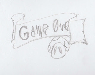
The Banner:
For the exhibition it’s self, I thought I’d draft a banner relative to the project. Since it is computer games what’s worse then seeing a “game over” screen? Seeing my design.

Media:
Adobe Illustrator CS5 + Photoshop CS5.
Draft = Hand Illustration.

Shape:
General Scroll shape, tried for a tinge in the paper, added a few icons plus some coins and BAM all pretty.

Style:
Cartoon/game creator style illustration.


The “controller”:
The concept of controlling your own world was an idea implanted by Mark Hilton himself. For the concept of the Actor to sit with the controller and to press buttons whilst the movie is playing to give the extra effect.


Media:
Adobe Illustrator CS5 + Photoshop CS5.
Draft = Hand Illustration.

Shape:
Couch/Chair and random dimensional person holding controller, simple not so elegant.
  
Style:
No real style.


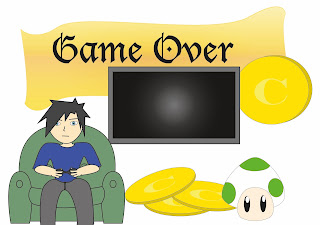
The Merger:
This draft was a tad tricky since I had run out of ideas. So I thought that I’d merge the two to make some super cool awesome design. This is what became of it.

 Media:
Adobe Illustrator CS5 + Photoshop CS5.
Draft = Hand Illustration.

Shape:
Cartoonish, simple.

Style:
No real style.


Thursday, 2 August 2012

Week 02 3D 2012


Practical – Design Choices
This week we had to come up with a design for a Charles Darwin University Design Student Shoulder Bag. We were allowed to use any tools we preferred, type up a description addressing:
-       Shape
-       Media
-       Style

Result
For this design I thought of the needs of this course and what the bag should consist of: A pencilcase, A4-A5 Sized pockets for Visual Art Dairys and paperwork, Somewhere to store a hard drive, water bottle, a phone and a mp3/ipod.

This is what the design came to look like =====>

Shape:
General shape of a single strap bag, added another strap connected by a clip for security. Besides what if you run there goes your bag right?

Media:
This concept has been done vie hand illustration, due to the fact that I can get a better grip on things whilst drawing. It’s my Forté. HB + 2B pencils + Fine Liner.

Style:
It has extra pockets for those bits and pieces, Velcro straps to keep the lose items intact and secure. An waterproof material inside and out. The rest is pretty self-explanatory.

Week 02 2D 2012


This week: Expanding your Knowledge.

This week we continued our group exercise and to create a background for our Blogger.

Group Exercise:
The group exercise from last week’s progress:
-        Accessing sources of information (individual web searches)
-        Merge Data (Scribe)

We continued with:
-        Evaluating Information (Group discussion)
-        Collating Information (group work with scribe)

End Result

What are the Top 5 search engines?
I’ll add the words “in the world” to be more specific
Google #1, Yahoo #2, Baidu #3, Bing #4 and Ask #5 (reference top 5 internet search engines in world)

What is the benefit of using different search engines?
Different results are produced by different search engines because results can vary depending on what you and others generally look at.

What alternative are there to search engine use?
You can visit a library to look at magazines, books – Michelle Turner is the creative arts library specialist at CDU
Forums and discussion boards
Industry specific websites
Local Galleries

Communicating with other artists and using web sites like:
Ø  Youtube
Ø  Whitepapers http://www.whitepapers.org/ - research reports
Ø  International Journa of Design http://www.ijdesign.org/ojs/index.php/IJDesign/
Ø  The design files http://thedesignfiles.net/
o   Referencing Methods: see Visual Diary Specs / Showreel Specs

What are some different ways to word your web searches?
You can put an “ around particular words to narrow the search to the string of words.
Add a “-“ to exclude certain words, for example – cats will return a search without reference to cats
Ctrl F, then type the word you are looking for on an opened web site to find your particular reference
You can also use the following features:
Ø  Google – wildcard for a broader search
Ø  Boolean Search – use and / or gives more variation on search
Ø  Google Scholar – research and peer review information, academic writers


Practical – Design Choices

We were asked to make a design for our blog website we were allowed to use any tools we liked. Afterwards we had to scribe a description (at least a paragraph) addressing these 3 points:
-        Shape.
-        Media.
-        Style.
 
I wanted something that was simple yet showed some of my artwork on it, all these images have been hand drawn wacked onto illustrator and fiddled with. Obviously I like the color blue – Don’t judge me, but it looks elegant yet justified.

Shape:
            Simply a square with a light color with a nice gradient.
Media:
Adobe Illustrator CS5, Adobe Photoshop CS5 and of course all my images were scanned and re-touched.

Style:
I don’t know if I have my own style, yet I mainly used manga/chibi style all free hand, non-color. And yes most of these characters are myself. I wouldn’t call it pure art but more so applied (by myself).